1
Former Lion offers theory why Chessum call-up led to Genge benching
1
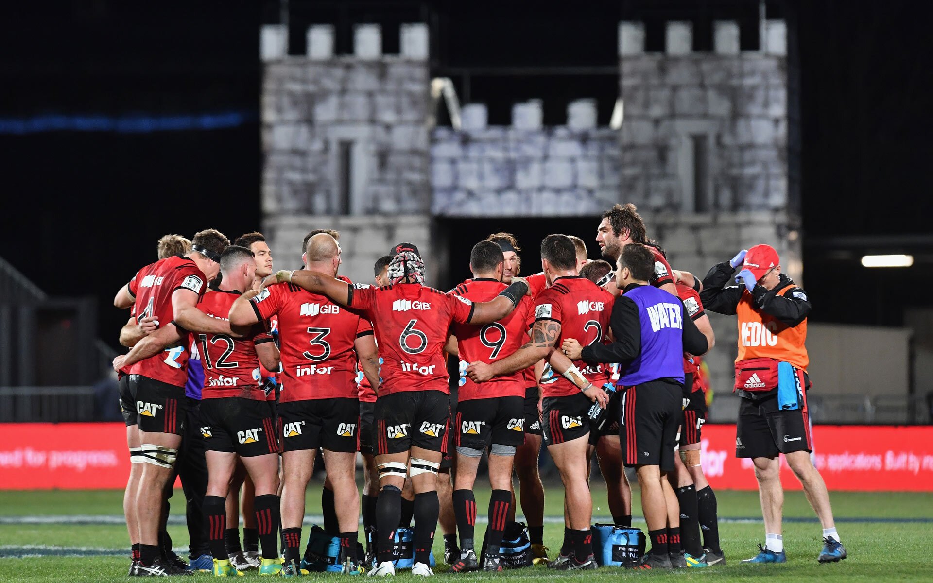
After a lengthy process, the Crusaders Super Rugby franchise have decided to stick with their current name for the foreseeable future.
Post the Christchurch shooting earlier this year, the franchise faced criticism for using a name heavily tied to religious wars that were waged between the 10th and 13th centuries.
A statement released by the Crusaders shortly after the event acknowledged the criticism and a formal process has since taken place to determine the way forward.
@CrusadersRugby have unveiled a new logo ahead of the 2020 @SuperRugby season.https://t.co/fJAHXHUITr#SuperRugby
— RugbyPass (@RugbyPass) November 29, 2019
Today, the Crusaders confirmed that the name would be retained but some fairly significant rebranding would still take place, with a a new logo unveiled.
The logo – a stylised ‘C’, is a significant change from the previous knight symbol.

“The Tohu (symbol) is shaped by our natural landscape which stretches from the top of the Southern Alps to the depths of our moana,” said Crusaders CEO Colin Mansbridge.
“Taking the form of the letter ‘C’ but expressed in a way that is unique to us. It nods to our legacy while moving us forward.”
Fans have quickly taken to social media to comment on the change – and the new emblem isn’t exactly receiving glowing reviews.
Wondering how much budget did Crusaders have to pay the designer therefore they got that crap logo
— der Säufer (@pilsnerian) November 29, 2019
Was there any tangata whenua input into the Crusaders logo? How can you keep a colonialist name and adopt indigenous design motifs? I’d love to think there was some thought behind this but can’t see where.
— Dan Slevin (@danslevin) November 29, 2019
The logo was a complete and utter disappointment.
— Liam ? (@Duckattacker) November 29, 2019
Gutless nzrfu for their handling of our Crusaders franchise! Crappy logo and soft cock approach all around. Shame!
— Peter Myers (@musopete) November 29, 2019
So good to see the Crusaders paying tribute to New Zealand’s rich history of political protest with their new logo, a mirrored image of the item thrown at Steven Joyce pic.twitter.com/CyBp4QXhlm
— Chris (@Lukeurmyson) November 29, 2019
Not a fan of the new Crusaders logo at all I personally didn’t see the point of changing 1 of the most iconic rugby logos to this they should of keep the original logo without a question (left old logo vs right for new) #Crusaders pic.twitter.com/iBOrev1Ilr
— Ben ? (@Lazybug47) November 29, 2019
https://twitter.com/firestorm616/status/1200220249708085248
It appears that by trying to please as many people as possible, the Crusaders have managed to alienate everyone. Based on social media, there are considerably more detractors of the new logo than there are supporters.
The new logo will be used for marketing and as much as is practically possible for the upcoming season, but it’s unclear whether it will be used on this year’s jerseys, which are set to be unveiled in the coming days.
The 2020 Super Rugby season will kick off at the end of January with the Crusaders playing their first match on February 1st.
WATCH: Former Crusader and All Black Andrew Mehrtens has a radical new idea for Super Rugby.
Join free and tell us what you really think!
Sign up for freeDespite a heavily disrupted season, Ireland's cornerstone tighthead is rolling back the years Down Under as he prepares to start an eighth straight Test.
The All Blacks are stacked at least four deep in most positions, but Scott Robertson will be concerned by his options in the playmaking roles.
Using a basic attack shape which has been around for years, the tourists are giving their Scottish supremo an armchair ride.
This is the first time I am making a comment on this platform. I just want to express my appreciation for Beauden! I have been a Beauden fan from the beginning of his career. Whether he makes it to the end of his contract in 2027, all the many scenarios that have been painted in this article and all the many comments relating to Richie, D-Mac and Love, whatever happens, happens, but, I am taking the opportunity to appreciate this great talent, great athlete, great rugby player and great man. I am bias, I hope he makes it to the 2027 world cup but who knows. What I do know is Beauden Barrett has been an outstanding All Black, he has represented the jersey with the mana, respect and reverence that comes with the black jersey. He is humble and doesn’t seek glory for himself but for the team, so for however long he plays, I will be watching, appreciating him as one of the greats of All Blacks rugby and I’ll be watching every other game the All Blacks play with Beauden in the team or no longer. I Love the ALL BLACKS NO MATTER WHAT!!
84 Go to commentsCome on Bra do your homework Fakatava has worn the Black jumper.
92 Go to commentsIm think 4-4-4 is a little ambitious too many players not enough tests.
92 Go to commentsYou obviously don’t expect that and don’t think the all blacks will win.
92 Go to commentsSKelton is 5x the player he was having gone to Sarries and France.
4 Go to commentsThey want a player that actually does proper work, not just someone who looks like they do.
Handling skills are good. But that’s. About. It.
Good for SR, not international materiel though. He had his chances, didn’t have the goods.
92 Go to commentsWell hopefully at least then we get to see him in NPC play lots of 13 and some 12
17 Go to commentsHave a listen to Nick Mallet’s take on Moerat.
92 Go to comments