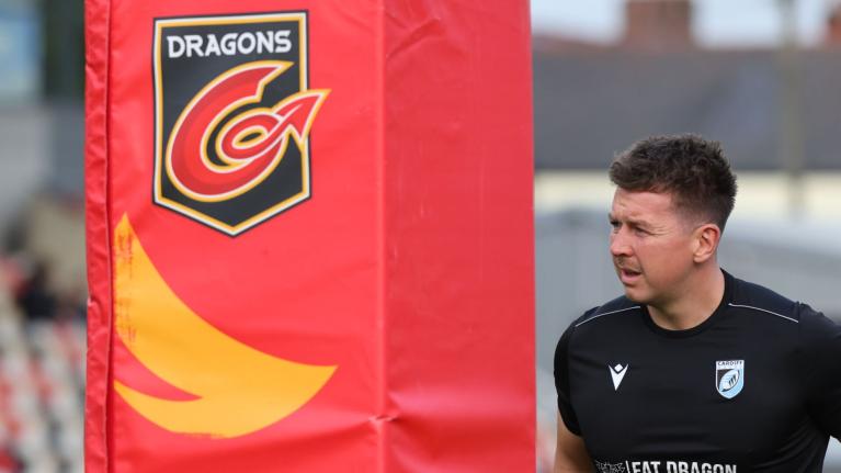
'I think it's awful' - Social reacts to leaked images of Dragons rebrand

Welsh rugby circles has been reacting to leaked images of what appears to be a rebrand by Welsh URC outfit Dragons.
Images of a new 'Dragons RFC' logo that was daubed on the wall at Rodney Parade have been doing the rounds, with many suggesting it looks remarkably similar to the old Newport RFC branding, at least in terms of colour, and the use of the fleur-de-lis symbol which strikes a simular visual note to the Prince of Wales's feathers on Newport's crest.
Gone is the dragon's tail, as indeed is any explicit visual reference to an actual mythical beast or the colour red.
It is the second Dragons rebrand in just five years and - if legitimate - could be an attempt to bring the team closer to its local roots.
Pic from Rodney Parade , all looks legit . I'm told it was discussed at the buttress Q&A too. pic.twitter.com/LbPvcQCRTs
— Dai Williams #FBIW (@DaiNewpt) June 24, 2022
Twitter has been reacting, and is often the case with rebranding, it's not been entirely positive. '
"I think it’s awful, they should not use black & amber, and why RFC, are they a club now or a regional team? If you are going to rebrand at least rebrand with a strong identity of your own. I think Buttress wishes it was Newport Dragons again, we did warn them" wrote one account. "1-why are they using black and amber? 2- the dragons are a Gwent regional team so why use RFC? Which as we all know stands for Rugby Football Club. 3- the dragons are a Gwent Regional team so why not incorporate colours from Ebbw Vale? 4- why rebrand?"
1-why are they using black and amber? 2- the dragons are a Gwent regional team so why use RFC? Which as we all know stands for Rugby Football Club. 3- the dragons are a Gwent Regional team so why not incorporate colours from Ebbw Vale? 4- why rebrand?
— Rugby (MF) 🇺🇦🏴🇺🇦 (@RugbyMF1) June 25, 2022
Another account observed: "Happy with this new re-brand Dragons fans? Absolutely horrendous. What the hell is that?"
Chris Roderick wrote: "Just my opinion (dangerous on Twitter) but I like the Dragons' new badge and them reverting to RFC. Seems a huge disconnect though in branding between the Ospreys and the other 3 pro clubs. Essentially 3 clubs and 1 regional rugby franchise. Each to their own, but optics are odd."
The similarity to the Newport logo irked others, one sarcastic Tweet reading: "A rugby club in Newport where Black and Amber will be prominent."
Others struck a positive note, with Jamie Philips noting: "People who are most angry about the Dragons RFC rebrand are not Dragons fans so it doesn’t matter as they are not the intended market. Supporters views are what matter most. Once it’s been officially launched and explained, I think the majority of fans will get on board with it."
He also pointed out that any hope of the supporters keeping quiet over the rebrand over the weekend seemed a bit of a leap. "I see the new ‘Dragons RFC’ badge has been doing the rounds on here. The rebrand is due to be announced on Monday. Bit silly telling supporters to keep schtum only to then put the new boardings up at Rodney Parade before officially announcing it."
The rebrand might be an interesting aside but it's ulitmately pretty insignificant when weighed against the massive turnaround needed on the pitch at Rodney Parade, where the Dean Ryan's side managed to go an entire season without giving their fans a victory at home.
Latest Comments
TESTED AND TRUSTED CRYPTOCURRENCY RECOVERY EXPERT CYBERSPACE HACK PRO
I'm Mrs. Richard Tammy from Orlando, and I recently fell victim to a trading forex scam that promised high returns on investment. Unfortunately, I lost a significant amount of $362,110. However, after researching online, I came across Cyberspace Hack Pro and decided to reach out to them for help. I'm thrilled to say that they were reliable, trusted, and efficient in recovering my scammed funds. I highly recommend Cyberspace Hack Pro to anyone who has been scammed and is seeking assistance in recovering their lost funds."
Contact details(:
WhatsApp +1 (659) 217 9239
Email Cyberspacehackpro @ rescueteam com
https://cyberspacehackpro0.wixsite.com/cyberspacehackpro
Go to commentsTESTED AND TRUSTED CRYPTOCURRENCY RECOVERY EXPERT CYBERSPACE HACK PRO
I'm Mrs. Richard Tammy from Orlando, and I recently fell victim to a trading forex scam that promised high returns on investment. Unfortunately, I lost a significant amount of $362,110. However, after researching online, I came across Cyberspace Hack Pro and decided to reach out to them for help. I'm thrilled to say that they were reliable, trusted, and efficient in recovering my scammed funds. I highly recommend Cyberspace Hack Pro to anyone who has been scammed and is seeking assistance in recovering their lost funds."
Contact details(:
WhatsApp +1 (659) 217 9239
Email Cyberspacehackpro @ rescueteam com
https://cyberspacehackpro0.wixsite.com/cyberspacehackpro
Go to comments