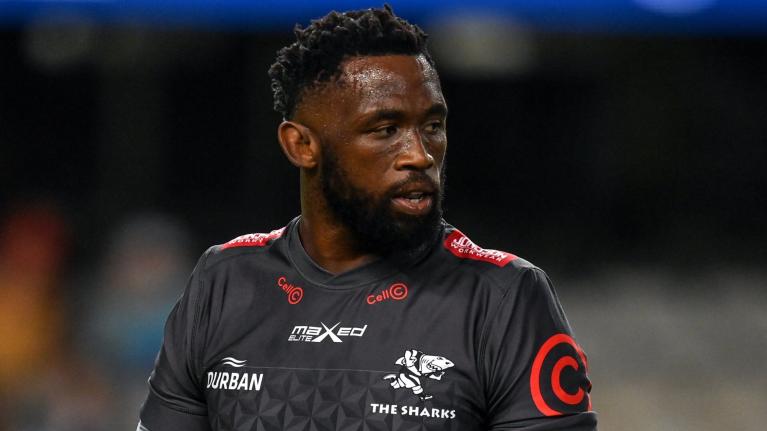
Mascot receives tweak as part of Sharks franchise rebrand

The Cell C Sharks have revealed that they moved Sharkie's fin slightly further up his back as part of a franchise rebrand.
The Sharks - who were taken over by MVM Holdings last year - have undertaken a number of small tweaks to their Chondrichthyes-themed logo, including giving the logo a shield shape and also adding Durban to the emblem.
A statement read: "Our much-loved mascot Sharkie has been at the coalface of fan engagement since the 1990s when he emerged as a fun-loving character that embodied The Sharks identity as a family brand. Sharkie remains iconic and whilst we don’t want to fix what is not broken, there was a need to adapt The Sharks logo.
"The Sharkie logo has been tweaked slightly and has undergone some refinements while retaining the essence of what Sharkie is all about. The changes include the placement of his dorsal fin higher up his back to make him more menacing and dangerous, much like the team he represents. The placement of his fin brings focus to his ferocity."
They have revealed a new slogan - 'Fear the Fin' - which is "to ensure it stays within the brand’s theme and portrays us as fierce east coast predators and is meaningful to our fans, who are encouraged to chant this slogan at our matches."
The new logo will be debuted on the Cell C Sharks kit for our first foray into the Heineken Champions Cup, although the old logo will still appear on the URC playing jersey for the 2022/2023 season, due to an eight-month kit production lead time.
Commenting on the rebrand, The Sharks CEO, Dr Eduard Coetzee said: “Re-igniting the passion for the brand amongst our loyal support base not just in South Africa, but globally is the driving force behind the rebrand as we broaden our reach and attract new markets internationally."
Latest Comments
This review highlights the effective recovery of lost cryptocurrency assets, particularly through the expertise of RUDER CYBER TECH SLEUTHS. Their advanced programs enable the tracing and retrieval of crypto tokens mistakenly sent to scammers. Before contacting RUDER CYBER TECH SLEUTHS, I didn't realize recovery was possible, but their professionalism and dedication have reshaped my outlook. They deserve greater recognition for their exceptional service and commitment to helping clients recover lost assets.
Go to commentsMy name is Graham Paterson. I am coping fine . Ardie Savea and Moana Pasfifika deserved there victory. The outstanding David Havili was missed .I think , if you leave out Christian Lio-Willie , who has been so good. Best if Tom Christie starts with Ethan Blackadder and Cullen Grace. Mitchell Drummond too at 9. Some of those guys were short of a gallop against a fired up Pasifika.
Go to comments